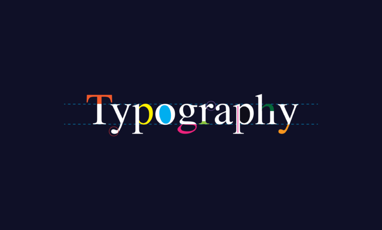
Anyone who is in the field of designing and marketing knows the value of attractive design. If you are presenting your stuff or content, the great visuals will help your efforts look more desirable and hence attract the customers. For that purpose, you need a strategy that can help you gain the best visual, and that is why typography is here. Typography will make a connection between the content and visuals, and the rest of the game depends on your mind. There are basic rules to follow, and that is up to you how to implement them. The 5 basic principles of beautiful and effective typography are as follows:
Font choice
The first basic step or principle of beautiful and effective typography is the choice of the font. You should take time while choosing or purchase font because it is the most visualized thing your eyes capture. If it gets time taking and tedious, do not worry because you cannot afford any ignorance during this process. There are different types of font available, and you can check and go through all of them. Serif are the ones that have a small design or are outwards at the ends, and the sans serif fonts do not show the extra bits present in the end; they are more like round. If you like handwriting look alike font, then you should choose script font.
Size
The second basic step or principle of beautiful and effective typography is the size of the font. You should think about which font size will look desirable and readable to all age groups whenever they open a website. You must first think about your audience and then choose the font, be it the style or the size. Another way of choosing the font is to print a page of your website; if it is readable on the paper for all age groups, then consider that. There should be a size difference between the heading and the body.
Alignment
The next step that needs your consideration is the alignment. The more organized page will look more attractive because the human mind finds organized objects more attractive. Select the layout and then arrange the headings, body texts, and the pictures having proximity. Your heading and the pictures must have the same height means they should be on an equal level. The unorganized page will tend to look messy.
The space between letters
The fourth basic step or principle of typography is the space between letters. After going through the three stages, look for the perfect space between letters because the letters with less space will look scrunched up. Less space will get difficult to read for people with weak eyesight. So, leave standard space between the letters.
Readability
The last step to look for is readability. When you are done, scan the whole process and analyze if it looks desirable enough. Will the reader want to go to the next page? If not, think about the other aspects that can make the page look more attractive, like background designs or colors.